Featured
Why ignoring mobile is crazy


By Matt Scott
Scott Design
March 6, 2015 — Capitola, CA
Back in the day, you designed for web browsers and email clients for users with a computer, sitting on their desk, with a good internet connection. Today, more emails are read on phones than on computers, and more people than ever browse the web on smartphones and tablets. More internet-connected devices hit the market every day. Plus, with larger screens for desktop and laptop computers, people often have more than one browser or email window open at a time, usually narrower than their full screen.
So, your site and emails may look terrible almost everywhere your customers are looking at them.
Web designers and the companies that hire them need to start thinking and working differently to make their sites accessible on the ever-growing combinations of devices and window sizes.
It’s simple, really: The easier you make your sites and emails to use on mobile, the happier your customers will be.
Overview: What’s in it for me?
If you’re a business owner, you need to know how responsive design can help you reach and keep more customers,  extend your brand, and improve your bottom line. If you’re a designer, you need to know the best way to design and maintain websites and emails. It’s called “job security,” people.
We’ll give you an introduction to a way of working that will:
- Get you better search engine results
- Give users a better experience on all screens … even those not yet invented
- Make your web and email design more efficient and less expensive
We’ll show you how to get a competitive edge as the world moves to mobile computing.
Early design: fixed screen size
In the beginning, the only place to see a website or read email was on a computer at your desk or on a laptop. Most users’ browsers and email client windows filled up the whole computer screen. You could have safely assumed that most of your audience used Internet Explorer and Microsoft Outlook on a Windows machine.
With one screen size, everyone had basically the same experience with websites and emails.
That’s not the case today.
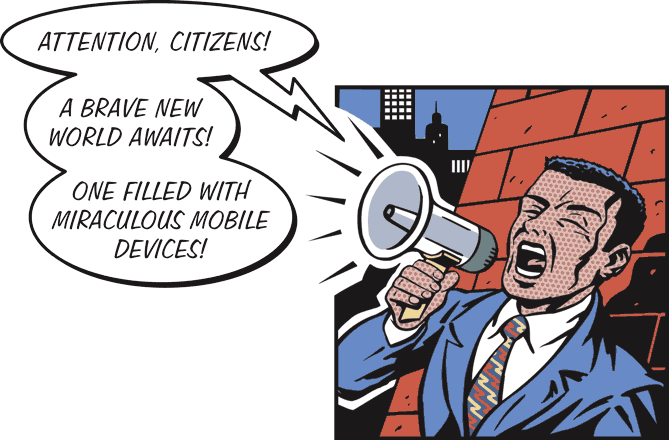
Say Hello to iPhone
Then came the iPhone, and overnight, everything changed…
Continue readaing original article here: https://www.hotdesign.com/marketing/why-ignoring-mobile-is-crazy/
###
Tagged Scott Design